"A collection of 20 logos,
which didn't make it to publication
due to various reasons."
The logo proposals are accompanied
by the design concept or some ideas
based on its visual identity
01. Amaze Club - A summer nightclub logo and several event posters based on sacred symbols.

02. Forty Bar & Coffee Lab - A colorful / pop branding identity.

03. Digikal - An electro logo, an approach for a sound & lighting services company.

04. Apotheke (warehouse in Greek) - The old warehouse building, depicted in the logo proposal.

05. Drama Enotourism Destination - The logo combines landscapes and sightseeings, as well as the winemaking heritage of the Region Of Drama

06. Dimitris Kalergis - A logo of the Architect and Object Designer's initials.

07. Quinta - Quinta - A logo of a nail salon consisting of 5 bright, warm colors (the client changed the brandname).

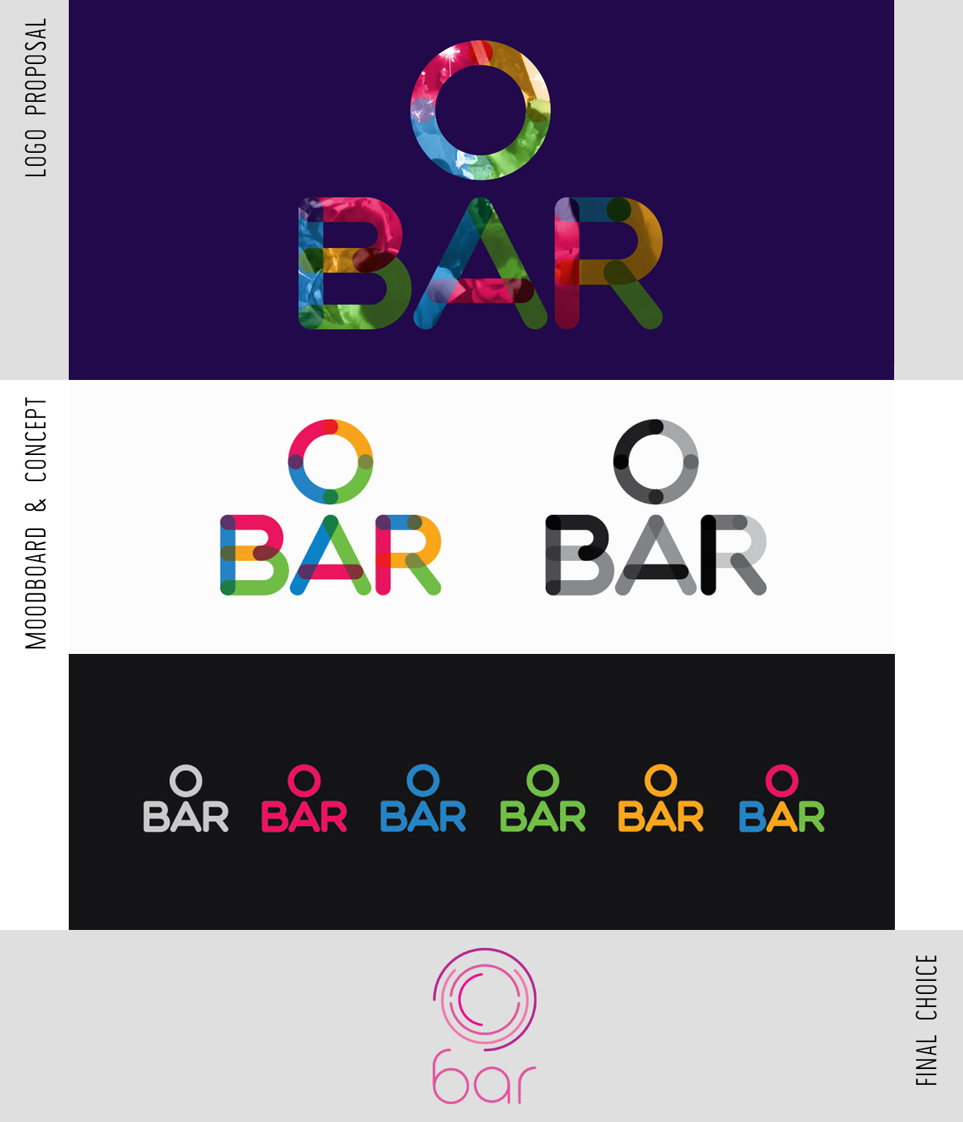
08. O Bar - A showcase of a simple, symmetrical typographic logo.

09. Bananistas - The Hawaiian "Shaka" gesture as the main idea for the design of a beach bar logo.

10. Graceland - The initial G, rotated by 90 degrees, to represent the exact location of the bar.

11. Junior Pappa - The international Morse Code as a method of transmitting sound was behind the inspiration of the design of a Dj's logo.

12. Lepi - A cartoonish style logo and branding identity for a seafood restaurant.

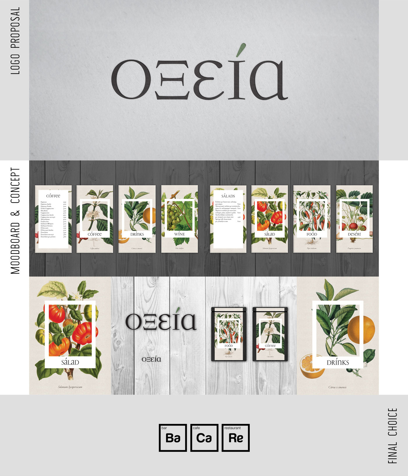
13. Oksia - A classic typographic logo with the use of botanical vintage illustrations in the restaurant's menu (the client changed the brandname).

14. Moutsios Holidays - A calligraphic hand-made logo for a travel agency.

15. Venice - A classy, elegant logo suggestion based on the city's architecture. Rejected because of misconceptions during the brief.

16. Eyestore - A logo of the letter "Y" forming an eye icon, full of rainbow colors.

17. Bioz - A set of 4 icons in a Circle representing the words Laboratory, Genetics,
Evolution and Biology

18. Geodoors - A company with the objective of making superior doors, was given a logo of a minimal, sharp symbol in the form of a house, using negative space.

19. Exoriktiki - The capital E, with a 3D effect to represent an excavation and construction business.

20. Cafe Gala - A logo based on the design of a floor tile used by the cafe, along with simple, straight typography.

"A rejection is nothing more
than a necessary step in the pursuit of success."

